Easy Expense
Discovery and Site Usability Testing
Responsibilities:
Competitive Analysis
Usability Testing
Wireframing
Prototyping
Role:
UX Researcher
Timeline:
4 weeks
Overview:
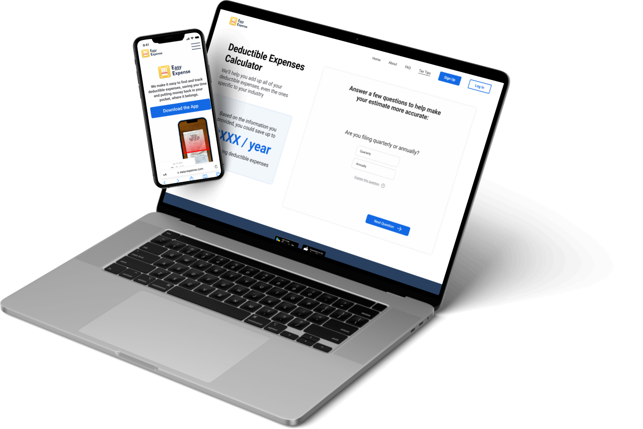
Easy Expense, an expense tracking app, was seeking to to expand their website to include a tax hub with various tax calculation features.
Our final product incorporated user-centered design, increased accessibility, and a fully functional tax calculator to help users convert their tracked expenses into valuable deductions.
Problem:
Easy Expense wanted to drive more traffic to their mobile app, and wanted to accomplish this through a tax calculator
Given that there are many income tax calculators available, Easy Expense sought to find the minimum features they would need to include in order to provide value to potential customers while also validating their need to track expenses. Easy Expense hope to drive traffic from the tax calculator to their mobile app.
Goals:
We wanted to conduct a competitive analysis to better understand the tax calculator market, and identify minimum features needed to make Easy Expense valuable and usable, as well as ways to differentiate Easy Expense in the market.
Then, we wanted to conduct usability testing to understand how users interact with the product and areas for growth.
Process
Competitor Analysis - We started by understanding what features and functionality were being offered by competitor tax calculators, as well as what wasn’t being offered, to help shape recommendations and opportunities for the Easy Expense calculator
Site Redesign - We also looked into the UI of the site, addressing some larger accessibility issues, site navigation problems and design elements such as branding and color scheme. As a financial company, developing a strong and trustworthy brand can be the biggest determiner of success, which is what we hoped to address with these improvements.
Wireframes - We built out wireframes that incorporated the features and opportunities we uncovered from our competitor research, as well as some of the redesign elements we thought would enhance the user experience
Usability Testing - We had 5 interviews with participants where we had them navigate through the prototype calculator and perform various tasks on the application for usability and design feedback.
01 - Competitor Analysis
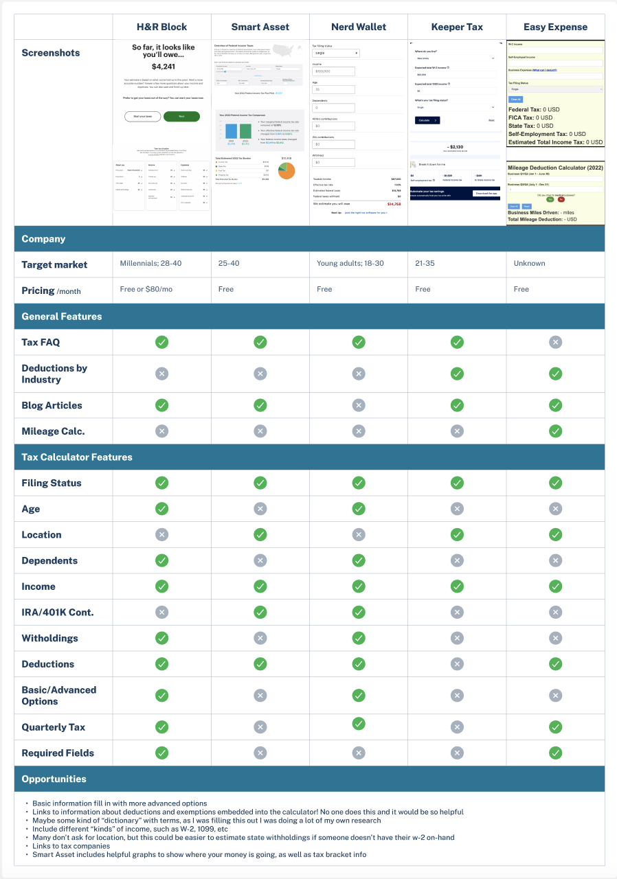
What we found after assessing 4 of the top income tax calculators across various features and pricing was that competitors were asking more detailed questions, and were able to provide more accurate income tax estimates. This analysis helped us determine how far we were from our target, as well as uncover some opportunities that the competitors had not touched on yet to give Easy Expense an edge on the market.
Key Takeaways:
Expanding the calculator to include features for freelancers and contractors could differentiate Easy Expense from the products already on the market
There are certain features shared across most currently available tax calculators that Easy Expense should model their product after
None of the most popular competitors include a mileage deduction calculator, but most users in user interviews identified gas as a major expense they tracked
02 - Site Redesign
As we were pulling together data to create a tax calculator, we noted that there were some more issues we believed needed to be addressed on the mobile app and website. Particularly, these issues related to:
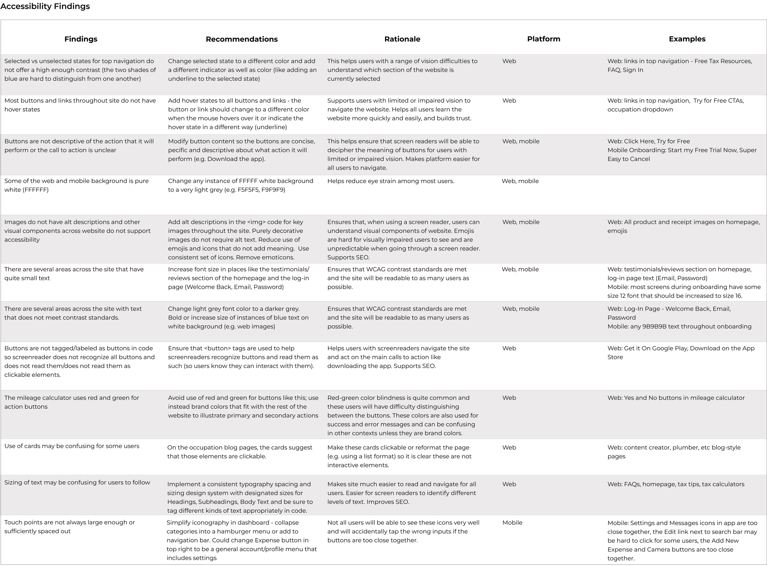
Accessibility - we noted right away that there wasn’t enough contrast between certain colors, and some of the fonts and sizing were difficult to read
UI - in terms of design and style, the mobile app and website looked quite outdated and not cohesive. For an e-commerce product, we wanted to bring a stronger and more trustworthy style and color palette in order to help users build trust in the brand.
Information architecture - we wanted to make some improvements and changes to the way the site was organized, as well as to add to and expand upon the existing content and pages. The structure was quite limited but confusing, and we wanted to simplify it while also creating more relevant content to support the brand and business model.
Accessibility Audit
Summary
Our main findings related to accessibility included (as summarized above):
Insufficient contract in colors across the site
Issues with the way the app was built, creating difficulties with screen-readers
Inconsistent font sizing leading to information hierarchy issues
Insufficient spacing
UI Improvements
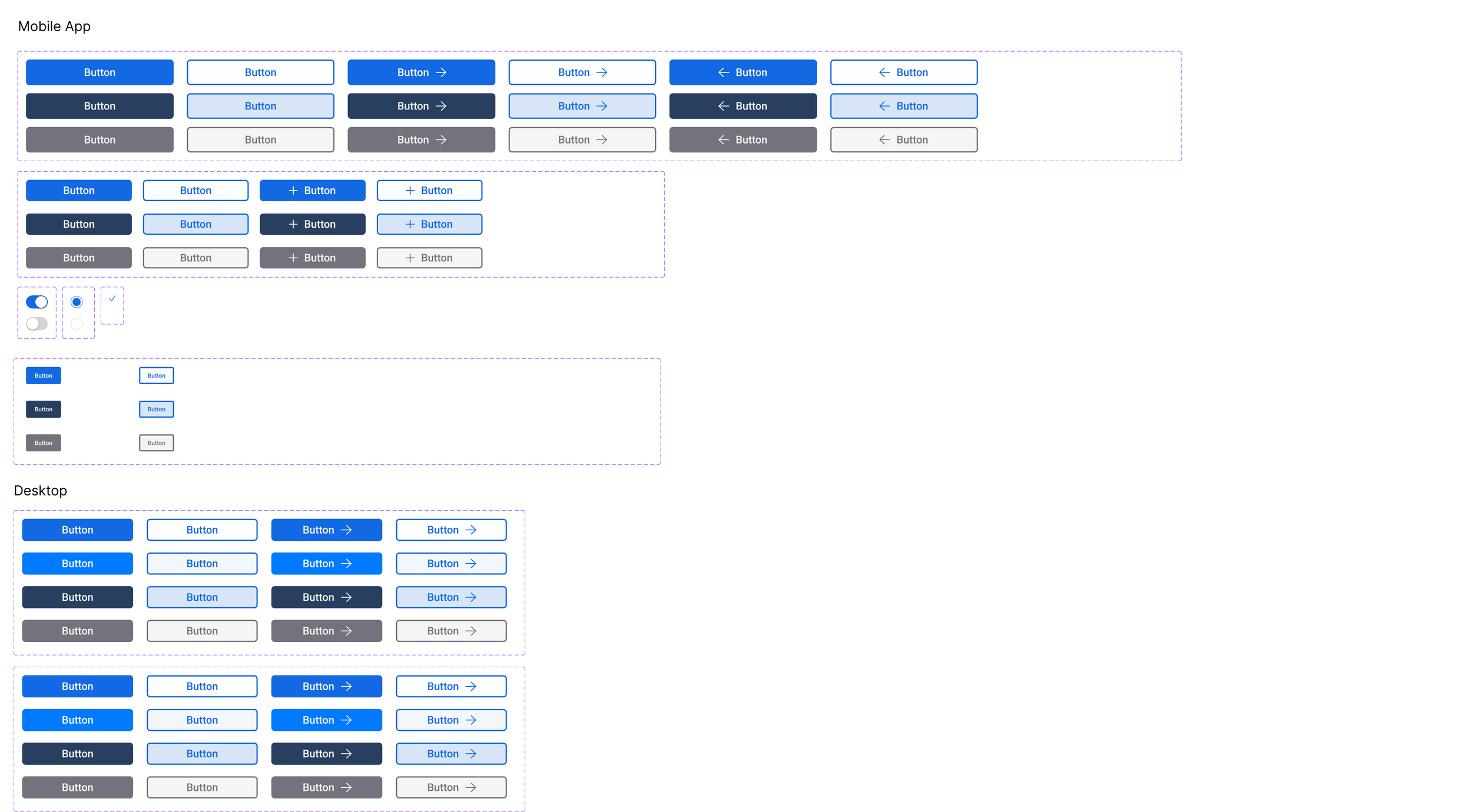
Because of the limited time scope of this project, we focused mainly on trying to build a new design system. We maintained a similar color palette to the original design system Easy Expense had in place, but added more font sizes to aid in information hierarchy, as well as more buttons to reflect different states (pressed, unpressed, primary, secondary). We slightly altered the color palette, with the goal of using intuitive, trustworthy colors to help users develop trust in the brand.
Site Map
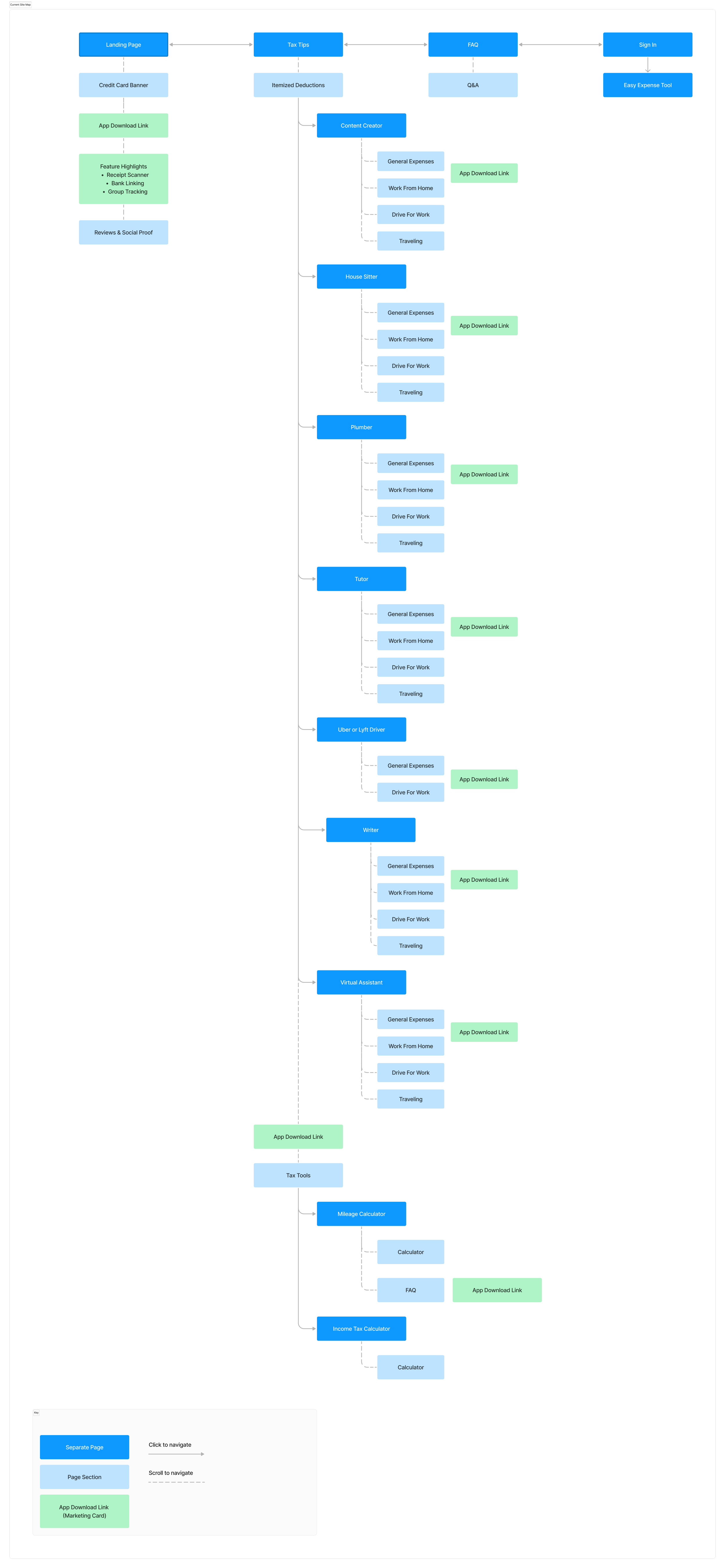
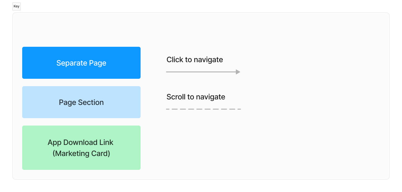
To the left is a recreation of the existing site organization. There were many pages within certain dropdowns, app download links on almost every page, and a generally unintuitive organization.
We proposed that the site organization be restructured for easier, more intuitive interaction for users. This re-organization, as seen below, would help to more clearly organize the site in a way where users could:
Access their intended page with fewer clicks
Have more strategic advertisement placement to enhance user experience
Generally have a faster, more efficient experience with Easy Expense
For the new site map, we prioritized reducing the number of pages, and having an easier and more intuitive site organization. Additionally, we proposed using app download ads in more targeted locations for more impact, as the existing site was overwhelming users with too many ads on every page.
03 - Wireframes
In putting together the wireframes, we had 3 main priorities:
Ensuring we put together an extensive and interactive tax calculator that met the initial request of the clients
Re-designing some elements of the app to increase accessibility and credibility
Reorganizing the structure of the mobile app to allow users to more easily and quickly access needed pages
Tax Calculator
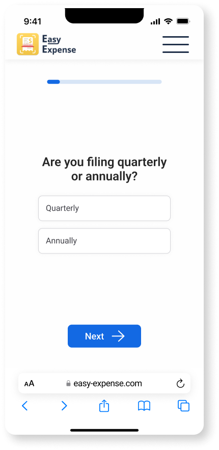
When creating the tax calculator, we wanted to create an experience that would be simple and reduce stress for the user. What we found in our research is that most users are not especially tax literate, and find taxes to generally be an overwhelming experience. Therefore we created an experience where users only had to focus on one input at a time, while allowing them to see their progress.
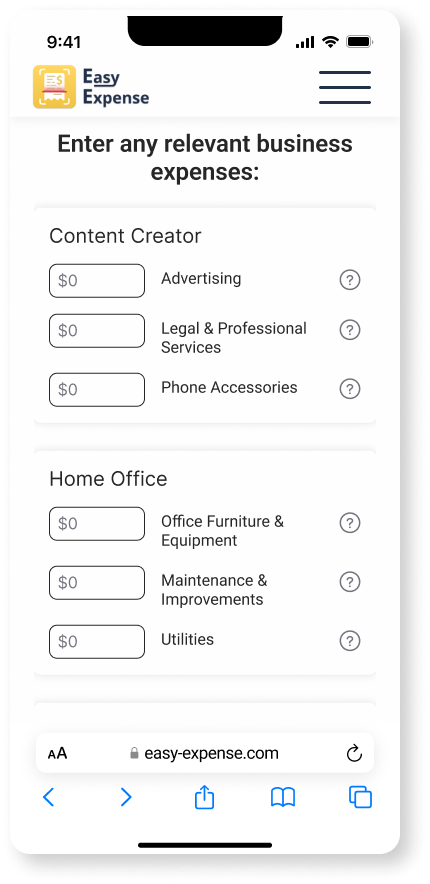
We also included a section with specific deduction categories based on their profession. This was to help users who may not be aware of the types of deductions they can receive based on the nature of their work. In this example, the “Content Creator” learns they can deduct expenses related to advertising, phone accessories, home office expenses, and so on. We noticed this was lacking from some of the competitor calculators, but users mentioned that it would be invaluable for them.
Increasing Credibility
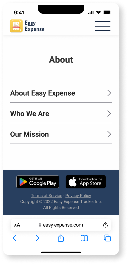
For an expense tracking app, users are required to attach their bank account and other personal information. Easy Expense is a lesser known brand, so we wanted to find ways to increase credibility to help users trust the brand. We started by just adding an “About” section to help users understand more about the mission and the founders, creating a fuller back story on who Easy Expense is as a brand.
Reorganization
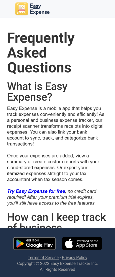
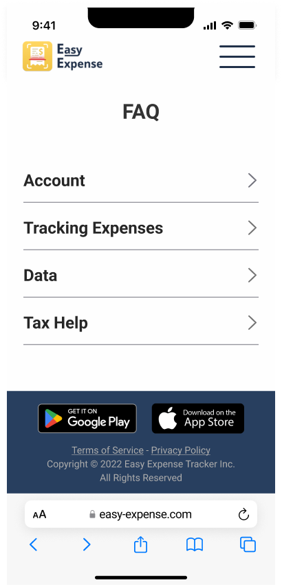
We also realized that many of the pages were not organized in a way that was easily or quickly accessible. An example was the FAQ page, which featured a very long scrolling page of questions, so if a user had a specific question they would have to scroll through the entire page and search closely for the answer. Instead, we put all of the questions into categories and implemented drop-down options to allow users to more easily find the answers they were looking for.
04 - Usability Testing
Objectives:
Gain impressions of the aesthetics of the site redesign
Have users explore the site and the ta calculator, and uncover any points of interest, hesitation and confusion
Determine whether the tax calculators are intuitive and include all potentially relevant fields
Identify any potential areas for expansion or improvement
Methodology:
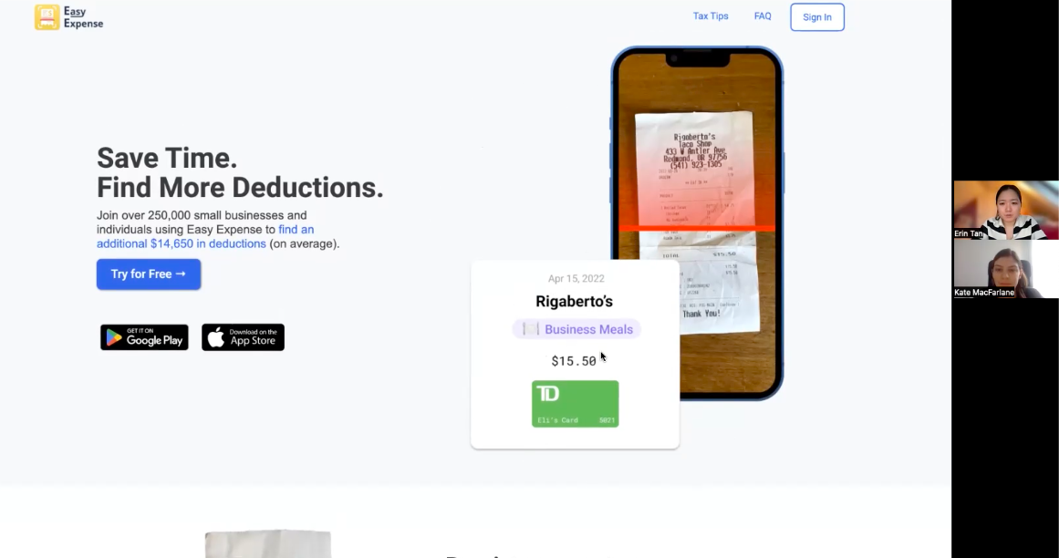
Remote moderated usability tests with high fidelity prototype
Participants:
5 users:
Ages 25-40
Self-employed or freelance workers
Working in a range of fields including baking, writing, and editing.
Tasks:
Users were asked to:
Give initial impressions of each page
Identify the purpose of the app
Interact with tax calculator and mileage deduction calculator and gain an income tax estimate
Interact with targeted deductions page to receive deductions for their job
Results:
Positive:
Users found the tax calculators intuitive to use
Users like the functionality of pointing out potential deductions, as many are not aware of the types of deductions they can receive or qualify for
Users found the layout of the site to be intuitive and efficient
Negative:
They struggled with understanding the exact purpose of the app from the homepage, indicating some restructuring was needed in this area
They thought that the number of ads in the site damaged the credibility, citing that it seemed like a scam
They liked the idea of the targeted deductions page, but wanted clarity on how this would be built out (i.e. would there be job categories with related expense deductions, or would there just be hundreds of jobs available to choose from)
05 - Final Prototype
05 - Next Steps
Because this was a time limited project (4 weeks), the next steps included implementing the recommended changes, and handing off to the developers. If I had more time on this project, I likely would have wanted to do another round of testing, as there were quite a few issues pointed out in the high fidelity prototype used during testing.
06 - Research Impact
Strategic Impact:
Product strategy was further developed and given a stronger, user-centered direction
This research will aid in planning next steps and product expansion, and play a role in the product’s future
Stakeholder Impact:
Sold the value of UX research and design to stakeholders, with plans to continue research to improve different segments of the product
Product Impact:
Developed and communicated important insights regarding usability issues to the team for quick and seamless implementation
Developed an accessible design system based on user research
07 - Lessons Learned
How to sell the value of UX research and design to stakeholders who are new to UX and still unclear on the value of engaging with research and design.
How best to work on a design team, where I gained so much valuable knowledge on how other designers work, and new tips and tricks that allowed me to really streamline my process and work more effectively.
