PostUp
Google Ventures Design Sprint
Responsibilities:
User Research
Wireframes
Prototyping
Usability Testing
Project Type:
Independent
Timeline:
1 week
Background:
The goal of this case study was to develop an easy, seamless way for remote workers to find a coffee shop to work from depending on their individual needs. I decided on this project because of my own experience as a remote worker. I found myself constantly struggling to find a coffee shop to work in that fit all the needs I require to work comfortably from a space, and wanted an easy, accessible solution.
Problem:
Solution:
When you have a limited amount of time to work, the last thing you want to do is spend 1 hour searching for and trying out different spaces, only to be frustrated and move onto the next space. For me, finding a good public work space has always been about finding a place with available outlets, and with a bustling atmosphere where I can take calls without the concern of bothering anyone. However, the process of finding a space that fits these needs is difficult enough to make me just pack up and go home.
With PostUP, remote workers can search for the type of setting they want, and filter based on what specific needs they have (bathroom, quiet atmosphere, outlets, distance, etc.)
Day 1: Brainstorm
User Interviews
There were a total of 3 interviews conducted. From these interviews, I learned that users:
Spend a lot of time finding a place to work
Spend time googling locations, looking through photos, and hunting through reviews to learn about amenities
Look at hours to get a sense of busy times
End-to-End User Experience
Based on the pain points described in user interviews, I set out to sketch what an ideal end-to-end experience may look like for the user to ground the next steps in the project
To develop this end-to-end experience, I started at the end with the page of the destination the user chose for their remote work. From there, I worked backwards, trying to capture the most basic way a user could reach the end while still meeting their needs as a remote worker. This experience represents the most basic experience, so that from here I could start to consider other paths to enhance the experience for the user.
Day 2: Sketching
Research:
My next step was to start sketching what the solution might look like in terms of UI and functionality. To begin, I looked through what currently existed in the market for helping users find work spaces. Based on users mentioning that they looked primarily at maps and reviews, I chose Google Maps and Yelp as a starting point.
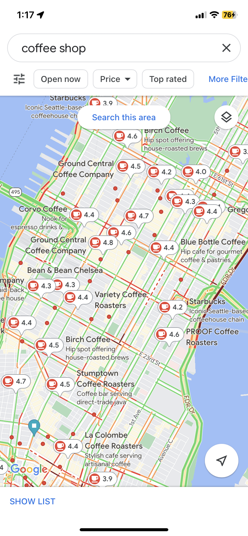
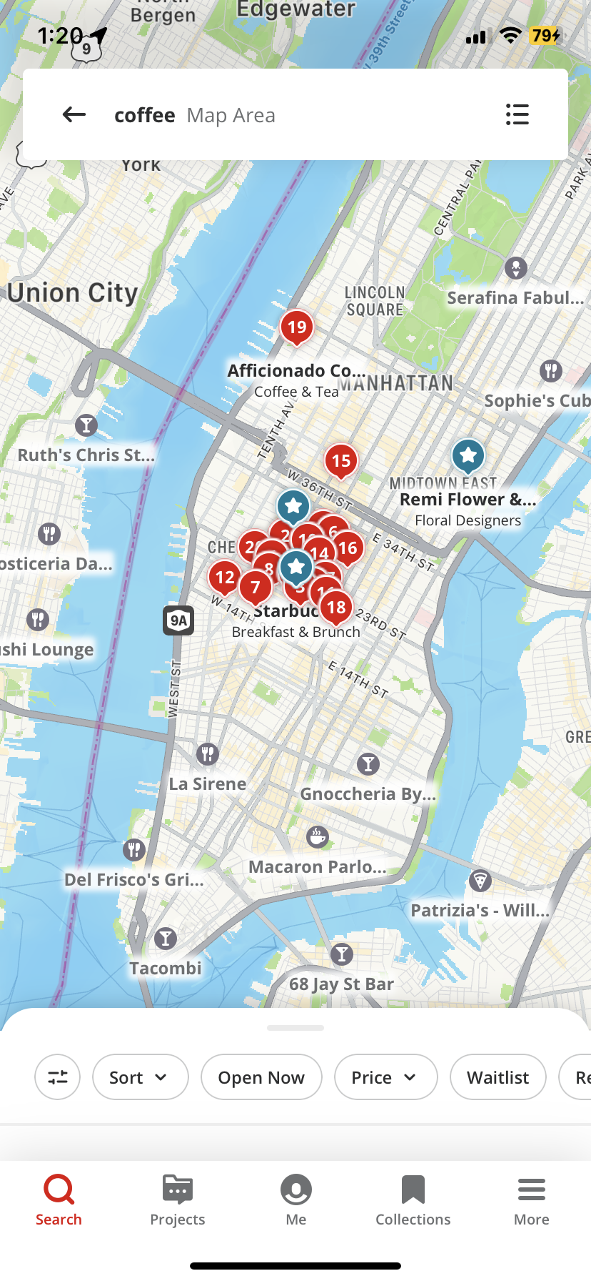
In reviewing competitors, I noted that when searching, all options first appear on a map, with the option to open up a list version of options that are listed by distance. For both apps, location services were used to show me locations conveniently in my area. From this, I learned that:
A list view is important to allowing users to get a click glance at what is local to them without having to click on every location
The map view serves the dual purpose of showing proximity as well as rating
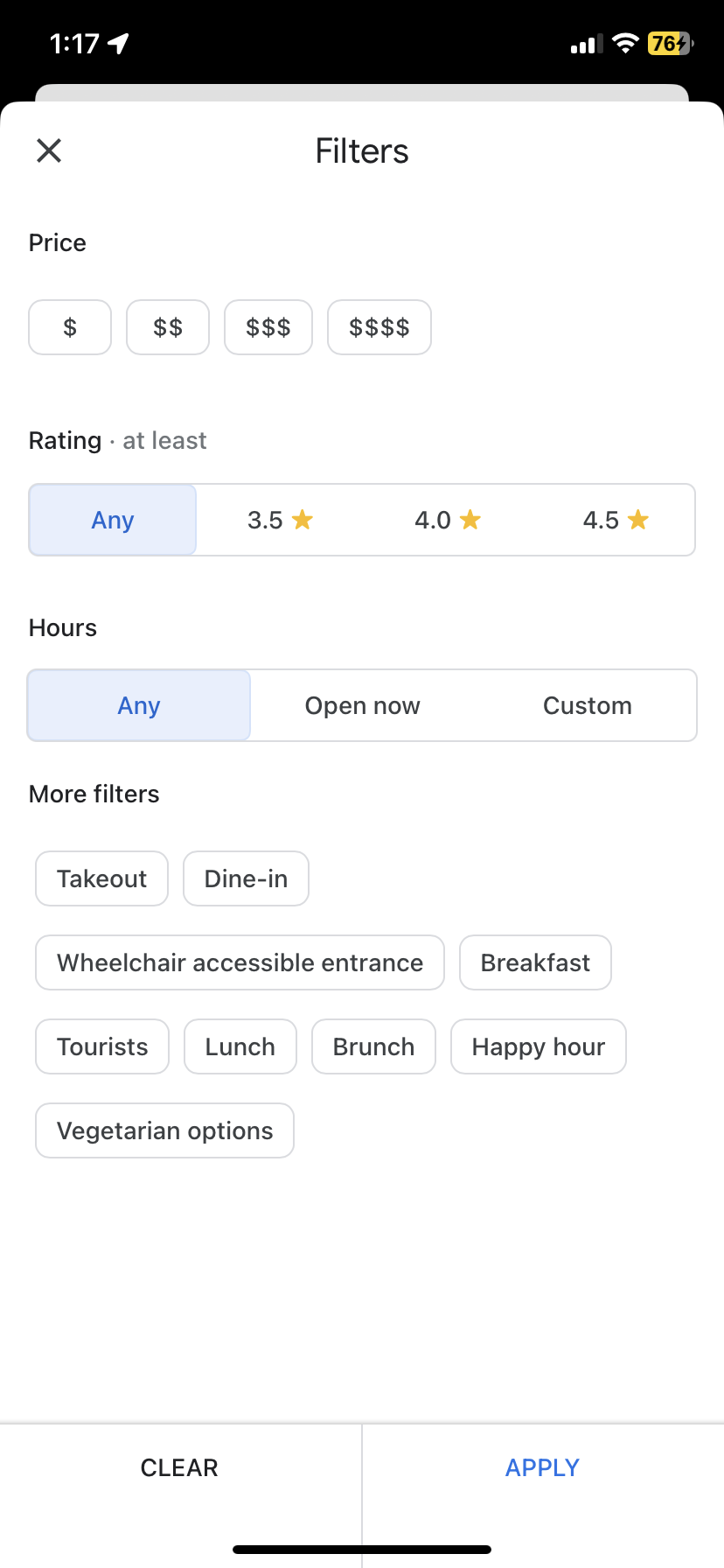
Looking at the filter options available, I was able to confirm what the user interviews showed: there aren’t filter options specific to remote working. Rather, the apps show options more related to customer service, quality of food, and dining options. There are some options available related to availability of wifi and bathrooms, but there is definitely room for more customization for the needs of the remote worker.
Sketching:
With my research, I was able to identify gaps in the existing market, and what features to prioritize to help PostUP fill some of those gaps. Using these initial ideas, I started to sketch out what the solution might look like, and how the existing interfaces could be upgraded to accommodate the needs of remote workers better
Day 3: Storyboard
Based on what I came up with on Day 2, I started to brainstorm what a longer storyboard might look like, and what I might add. What was missing? How could I ensure that users were getting what they wanted from the app? I started with more onboarding and lead up to my solution sketch to give a better idea of what the process would look like, and the seamlessness with which it could progress
Day 4: Prototyping
I chose to develop a prototype to test a more realistic user experience. I have found that I usually get better feedback when users are not paying attention to the low fidelity aspect.
In creating the prototype, I used my storyboard as a reference, but also updated some details as I went. I used Marvel, as I like that there are pre-made elements that can be used but there is still a high level of customizability. I was looking to quickly and efficiently make a high quality prototype, and Marvel was the easiest tool at my disposal.
For the first 3 screens, I mainly stuck with what I had sketched out in the storyboard. I kept the loading screen, permission to access location, and the home screen with the search bar. I did add a tab bar at the end to give users more functionality. I also removed the “suggestions” I had in the storyboard to make the interface a bit less cluttered.
For the prototype, I also chose to build out the filters more to give potential users a better idea of what options they would have when searching for a remote workspace. Additionally, on the shop page, I put more details to showcase what information users would have access to about the shop to get feedback on whether this was sufficient, or whether users wanted more information.
Day 5: Testing
I conducted testing with 5 individuals to get a sense of what participants struggled with, what they noticed, and feedback on the flow of the prototype
Mainly, users pointed out:
When clicking search, the next screen that automatically popped up was filters. Users mentioned that there needed to be a screen in the middle, and the option to select filters
They liked the clean aesthetic, but thought that the page for the actual coffee shop was a bit cluttered
They would have liked more filter options, with many users mentioning wanting the option to see information about food and drink quality, whether the space was conducive for collaborative work, table sizes, and buying minimums.
First, I created a step in between the home screen and the filter screen for a more seamless flow, and to give the users a more authentic search experience. With this screen, users get an idea of what their search screen will look like, how to access the filter function, and also see that when they search, their searches will be saved (and can also be removed!)
I also built out the amenities to be more comprehensive and also inclusive of gender identity and disabilities. I included popular categories so users can quickly find the best coffee shops and restaurants in the area.
Finally, I cleaned up the shop page for easier scan-ability and a cleaner interface
To fix these issues, I added more screens to (1) Fill in the gap between search and filter, (2) clean up the cluttered UI and (3) create another screen with more filter options
Final Prototype!
Reflection
In finishing this design sprint, I definitely learned a lot about agile UX and how the design process can be quick and simple. I also learned a lot about what I could improve on as both a designer and a researcher, including:
More Research! This project was much less research heavy, and I found myself wishing I had a bit more insight into what users wanted from the product. I know that is the nature of the sprint, but it really helped me understand the value of research in the UX process
Iteration is everything! The prototype I put together on day 5, while being proud of it, I also recognize it was very minimal and needed a lot of work if it were to eventually become a real product. I learned so much from just one round of testing, so being able to test and iterate a few more times would have been invaluable.


